Extended: More Complex Pedigree Plots with ggPedigreeInteractive
Source:vignettes/articles/v21_extendedinteractiveplots.Rmd
v21_extendedinteractiveplots.Rmd
library(ggpedigree) # ggPedigree lives here
library(BGmisc) # helper utilities & example data
library(ggplot2) # ggplot2 for plotting
library(viridis) # viridis for color palettes
library(tidyverse) # for data wrangling
This vignette demonstrates how to create interactive pedigree plots
using the ggPedigreeInteractive() function from the
ggpedigree package. It extends the basic examples found in
the main package documentation.
Customising labels and tool‑tips
ggPedigreeInteractive() accepts the same config list as
ggPedigree(), plus the tooltip_columns argument for hover
text. Below we enable node labels, nudge them upward a little, color by
sex, and show both the personID and name fields in the
hover:
plt <- ggPedigreeInteractive(
  potter,
  famID = "famID",
  personID = "personID",
  momID = "momID",
  dadID = "dadID",
  config = list(
    label_nudge_y = .25,
    label_include = TRUE,
    label_method = "geom_text",
    sex_color_include = TRUE
  ),
  tooltip_columns = c("personID", "name")
)
pltFurther customisation
Adding tooltips
Because the function returns a Plotly object, you can layer additional modifications on top:
plt2 <- plt %>%
  plotly::layout(
    title = "The Potter Family Tree (interactive)",
    hoverlabel = list(bgcolor = "white"),
    margin = list(l = 50, r = 50, t = 50, b = 50)
  ) %>%
  plotly::config(displayModeBar = TRUE)
plt2You can also save the widget as standalone HTML:
htmlwidgets::saveWidget(
  plt,
  file = "potter_interactive.html",
  selfcontained = TRUE
)
# Note: The above code will save the widget in the current working directory.
Static Plot customisation
You can also create a static version of the plot using the
return_static argument. This is useful for generating
high-quality images for reports or publications. The static plot can be
further customized using ggplot2 functions. It can also be plotted using
plotly::ggplotly() to retain interactivity.
static <- ggPedigreeInteractive(
  potter,
  famID = "famID",
  personID = "personID",
  momID = "momID",
  dadID = "dadID",
  config = list(
    label_nudge_y = .25,
    label_include = TRUE,
    label_method = "geom_text",
    sex_color_include = TRUE,
    return_static = TRUE
  ),
  tooltip_columns = c("personID", "name")
)
The static plot can be further customized using ggplot2 functions.
static_plot <- static +
  ggplot2::labs(
    title = "The Potter Family Tree (static)",
    subtitle = "This is a static plot"
  ) +
  theme_bw(base_size = 12) +
  theme(
    panel.grid.major = element_blank(),
    panel.grid.minor = element_blank(),
    panel.background = element_blank(),
    axis.line        = element_line(colour = "black"),
    axis.text.x      = element_blank(),
    axis.text.y      = element_blank(),
    axis.ticks.x     = element_blank(),
    axis.ticks.y     = element_blank(),
    axis.title.x     = element_blank(),
    axis.title.y     = element_blank()
  ) + scale_color_viridis(
    option = "inferno",
    discrete = TRUE,
    labels = c("Female", "Male", "Unknown")
  )
#> Scale for colour is already present.
#> Adding another scale for colour, which will replace the existing scale.

static_plot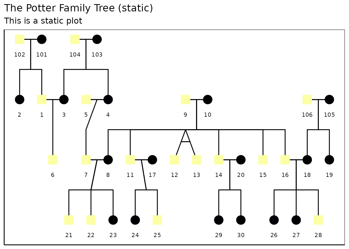
You can also convert the static plot back to an interactive plot
using plotly::ggplotly():
plt2 <- plotly::ggplotly(static_plot,
  tooltip = "text",
  width   = NULL,
  height  = NULL
)
plt2Customizing the interactive plot
You can customize the interactive plot further by modifying the
layout, adding titles, and adjusting hover labels. The
plotly::layout() function allows you to set various layout
options such as title, margins, and hover label styles.
library(BGmisc)
data(hazard)

df <- hazard

ggPedigreeInteractive(
  df,
  famID = "famID",
  personID = "ID",
  momID = "momID",
  dadID = "dadID",
  config = list(
    code_male = 0,
    status_column = "affected",
    label_nudge_y = .25,
    label_include = TRUE,
    include_tooltip = TRUE,
    label_method = "geom_text",
    sex_color_include = TRUE
  ),
  tooltip_columns = c("personID", "birthYr", "onsetYr", "deathYr")
) %>%
  plotly::layout(
    title = "Hazard Pedigree (interactive)",
    hoverlabel = list(bgcolor = "white"),
    margin = list(l = 50, r = 50, t = 50, b = 50)
  ) %>%
  plotly::config(displayModeBar = TRUE)
#> Warning in buildPlotConfig(default_config = default_config, config = config, :
#> The following config values are not recognized by getDefaultPlotConfig():
#> include_tooltip
Conclusion
ggPedigreeInteractive() provides a powerful way to
visualize pedigree data interactively. By leveraging the capabilities of
Plotly, users can explore their data in a more dynamic and engaging
manner. The function is designed to be flexible, allowing for
customization of labels, tooltips, and overall aesthetics.