Overview
This vignette recreates the style of a figure in Garrison
and Rodgers (2016) using ggplot2 and example data from
NLSY79 on SES and flu vaccinations.
Data Preparation
Data Cleaning
This section reuses the data preparation pipeline developed in the regression vignette.
That vignette demonstrated how to set up data for discordant regression analysis by using discord data processing tools. Those tools facilitate the construction of kinship links, including identifying sibling pairs, merging sibling characteristics, and calculating pair-level variables.
Here, we reuse that same pipeline to prepare the data for plotting. Specifically, we apply the same kinship pairing, data merging, and cleaning procedures, but our focus is now on visualizing patterns rather than fitting regression models.
The underlying dataset is the NLSY79, which includes measures of flu vaccination and socioeconomic status (SES) for kinship pairs. As in the regression vignette, we restrict the sample to individuals who are housemates and have a relatedness of 0.5.
For full details on the data processing and kinship link construction, see the regression vignette.
Click to expand data preparation code
# Setup: Use discord_data
# Visualizing the Results

library(discord)
library(NlsyLinks)
library(tidyverse)
library(ggplot2)
library(grid)
library(gridExtra)
library(ggExtra)
library(janitor)

# Load the data
data(data_flu_ses)

# Get kinship links for individuals with the following variables:
list_vars <- c(
  "FLU_total", "FLU_2008", "FLU_2010",
  "FLU_2012", "FLU_2014", "FLU_2016",
  "S00_H40", "RACE", "SEX"
)

df_link_pairs <- Links79PairExpanded %>%
  filter(RelationshipPath == "Gen1Housemates", RFull == 0.5)


df_link <- CreatePairLinksSingleEntered(
  outcomeDataset = data_flu_ses,
  linksPairDataset = df_link_pairs,
  outcomeNames = list_vars
)

df_consistent_kin <- df_link %>%
  group_by(SubjectTag_S1, SubjectTag_S2) %>%
  count(
    FLU_2008_S1, FLU_2010_S1,
    FLU_2012_S1, FLU_2014_S1,
    FLU_2016_S1, FLU_2008_S2,
    FLU_2010_S2, FLU_2012_S2,
    FLU_2014_S2, FLU_2016_S2
  ) %>%
  na.omit()

# Create the df_flu_modeling object with only consistent responders.
# Clean the column names with the {janitor} package.
df_flu_modeling <- semi_join(df_link,
  df_consistent_kin,
  by = c(
    "SubjectTag_S1",
    "SubjectTag_S2"
  )
) %>%
  clean_names()
Creating the Discord Data
With the data prepared, we restructure it using
discord_data().
library(tidyverse)
library(ggplot2)

df_discord_flu <- discord_data(
  data = df_flu_modeling,
  outcome = "flu_total",
  predictors = "s00_h40",
  id = "extended_id",
  sex = "sex",
  race = "race",
  pair_identifiers = c("_s1", "_s2"),
  demographics = "both"
) %>%
  filter(!is.na(s00_h40_mean), !is.na(flu_total_mean))
Because we are interested in differences between kin, we create a new
variable, ses_diff_group, that classifies SES differences
into three categories: “More Advantaged”, “Equally Advantaged”, and
“Less Advantaged”. This variable is later used to group observations in
the marginal density plots. They serve to help visualize how the
distributions of mean SES and mean flu vaccinations differ across these
SES difference categories.
df_discord_flu <- df_discord_flu %>%
  mutate(
    ses_mean_group = factor(
      case_when(
        as.numeric(scale(s00_h40_mean)) > 0.5 ~ "More Advantaged",
        as.numeric(scale(s00_h40_mean)) < -0.5 ~ "Less Advantaged",
        abs(as.numeric(scale(s00_h40_mean))) <= 0.5 ~ "Equally Advantaged"
      ),
      levels = c(
        "Less Advantaged",
        "Equally Advantaged",
        "More Advantaged"
      )
    ),
    # # Classify Difference Grouping
    ses_diff_group = factor(
      case_when(
        as.numeric(scale(s00_h40_diff)) > 0.5 ~ "More Advantaged",
        as.numeric(scale(s00_h40_diff)) < -0.5 ~ "Less Advantaged",
        abs(as.numeric(scale(s00_h40_diff))) <= 0.5 ~ "Equally Advantaged"
      ),
      levels = c(
        "Less Advantaged",
        "Equally Advantaged",
        "More Advantaged"
      )
    )
  )
Setting Up Color Palette
To enhance the visualizations, we define a color palette that reflects the SES differences between siblings. Here, we use a gradient that transitions from red to blue. This color scheme helps to intuitively convey the direction and magnitude of SES differences, with red indicating lower SES and blue indicating higher SES. Missing values are represented in purple, which is approximately midway between red and blue.
# Create a color palette for the shading
color_shading_4 <- c("firebrick4", "firebrick1", "dodgerblue1", "dodgerblue4")
color_na <- "#AD78B6" # purple for missing values

color_shading_3 <- c(color_shading_4[2], color_na, color_shading_4[3])

# Determine the range of SES differences for color scaling
max_val_scale <- max(abs(df_discord_flu$s00_h40_diff), na.rm = TRUE)

# values <- seq(-max_val_scale, max_val_scale, length = length(color_shading_4))
Plotting the Results
Individual Level Plot
This plot is for looking at individual-level data rather than sibling pair means or differences. It provides context for understanding the relationship between SES and flu vaccinations before examining sibling differences.
This scatter plot shows individual SES at age 40 against individual flu vaccinations. Point color indicates the SES difference between siblings.
The first step is to create the base plot with sibling 1 data. In the next code block, we add sibling 2 data to the plot.
# Individual level plot
plot_indiv <- plot_indiv_sib1 <- ggplot(
  df_flu_modeling,
  aes(
    x = s00_h40_s1,
    y = flu_total_s1,
    color = s00_h40_s1 - s00_h40_s2
  )
) +
  geom_point(
    size = 0.8, alpha = 0.8, na.rm = TRUE,
    position = position_jitter(width = 0.2, height = 0.2)
  ) +
  geom_smooth(method = "lm", se = FALSE, color = "black")
But if we only plot sibling 1, we can visualize that first.
plot_indiv_sib1 +
  scale_colour_gradientn(
    name = "Sibling\nDifferences\nin SES",
    colours = color_shading_4,
    na.value = color_na,
    values = scales::rescale(c(-max_val_scale, max_val_scale))
  ) +
  labs(
    x = "SES at Age 40",
    y = "Flu Vaccination Count"
  ) +
  theme_minimal() +
  ggtitle("Individual Level Plot: Sibling 1 Only") +
  theme(plot.title = element_text(hjust = 0.5))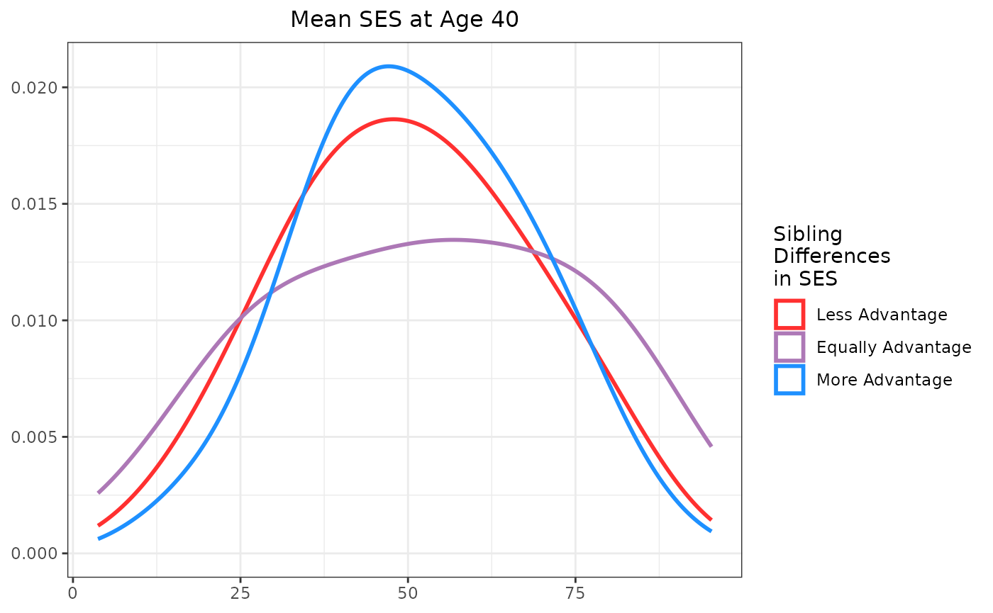
Now, we add sibling 2 to the plot, using the same color scheme to indicate SES differences between siblings.
plot_indiv <- plot_indiv +
  # added sibling 2 to the plot
  geom_point(
    size = 0.8, alpha = 0.8, na.rm = TRUE,
    position = position_jitter(width = 0.2, height = 0.2),
    aes(
      x = s00_h40_s2,
      y = flu_total_s2,
      color = s00_h40_s2 - s00_h40_s1 # this reverses the color difference so sibling 2 points use the opposite color gradient compared to sibling 1, making it visually clear which sibling is being represented and how their SES difference is encoded
    )
  ) +
  scale_colour_gradientn(
    name = "Sibling\nDifferences\nin SES",
    colours = color_shading_4,
    na.value = color_na,
    values = scales::rescale(c(-max_val_scale, max_val_scale))
  ) +
  labs(
    x = "SES at Age 40",
    y = "Flu Vaccination Count"
  ) +
  theme_minimal() #+
#  theme(legend.position = "none")

plot_indiv +
  ggtitle("Individual Level Plot") +
  theme(plot.title = element_text(hjust = 0.5))
The individual-level plot shows a positive association between SES and flu vaccinations. Higher SES individuals tend to have higher flu vaccination rates. The color gradient indicates the SES difference between siblings, providing additional context for interpreting the data.
plot_indiv_s00 <- ggplot(
  df_flu_modeling,
  aes(
    x = s00_h40_s1,
    y = s00_h40_s2,
    color = s00_h40_s1 - s00_h40_s2
  )
) +
  geom_point(
    size = 0.8, alpha = 0.8, na.rm = TRUE,
    position = position_jitter(width = 0.2, height = 0.2)
  ) +
  geom_smooth(method = "lm", se = FALSE, color = "black")


plot_indiv_s00 +
  scale_colour_gradientn(
    name = "Sibling\nDifferences\nin SES",
    colours = color_shading_4,
    na.value = color_na,
    values = scales::rescale(c(-max_val_scale, max_val_scale))
  ) +
  labs(
    x = "SES at Age 40 (Sibling 1)",
    y = "SES at Age 40 (Sibling 2)"
  ) +
  theme_minimal() +
  ggtitle("Individual Level Plot: SES Comparison Between Siblings") +
  theme(plot.title = element_text(hjust = 0.5))
#> `geom_smooth()` using formula = 'y ~ x'
#> Warning: Removed 16 rows containing non-finite outside the scale range
#> (`stat_smooth()`).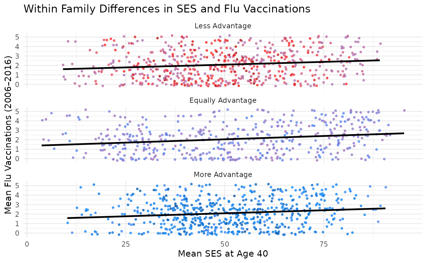
plot_indiv_flu <- ggplot(
  df_flu_modeling,
  aes(
    x = flu_total_s1,
    y = flu_total_s2,
    color = s00_h40_s1 - s00_h40_s2
  )
) +
  geom_point(
    size = 0.8, alpha = 0.8, na.rm = TRUE,
    position = position_jitter(width = 0.2, height = 0.2)
  ) +
  geom_smooth(method = "lm", se = FALSE, color = "black")


plot_indiv_flu +
  scale_colour_gradientn(
    name = "Sibling\nDifferences\nin SES",
    colours = color_shading_4,
    na.value = color_na,
    values = scales::rescale(c(-max_val_scale, max_val_scale))
  ) +
  labs(
    x = "Flu Vaccinations (Sibling 1)",
    y = "Flu Vaccinations (Sibling 2)"
  ) +
  theme_minimal() +
  ggtitle("Individual Level Plot: FLU Comparison Between Siblings") +
  theme(plot.title = element_text(hjust = 0.5))
#> `geom_smooth()` using formula = 'y ~ x'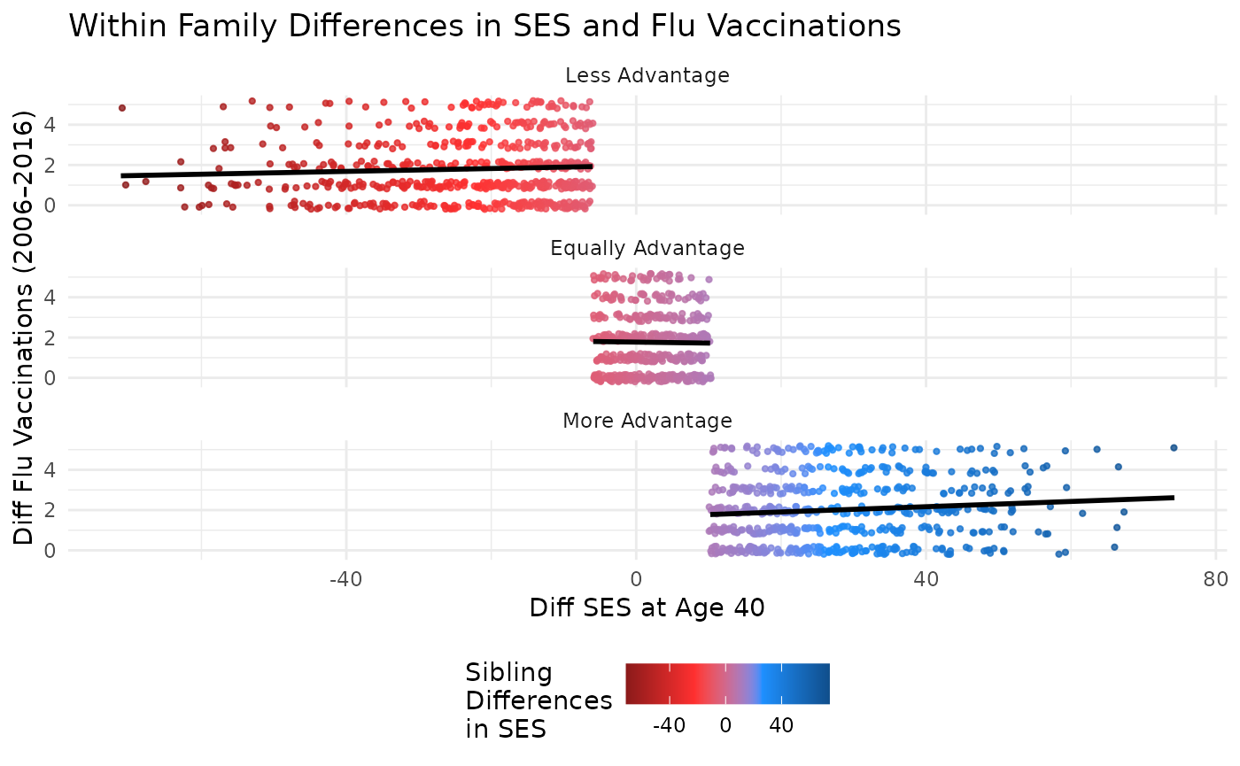
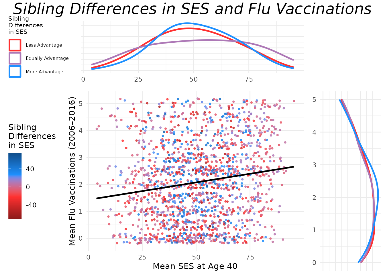
Family Level Plots
Between Family Plots
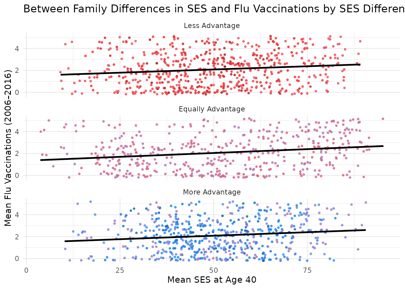
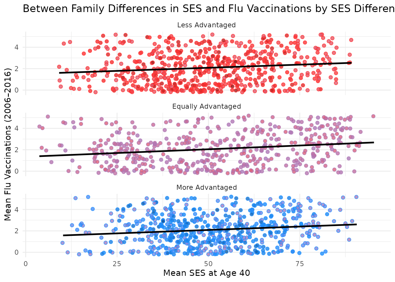
This section creates a between-family plot that visualizes mean SES at age 40 against mean flu vaccinations for sibling pairs. Points are colored based on the SES difference between siblings. Each point represents a sibling pair, with the x-axis showing the pair’s average SES and the y-axis showing the average number of flu vaccinations.
plot_btwn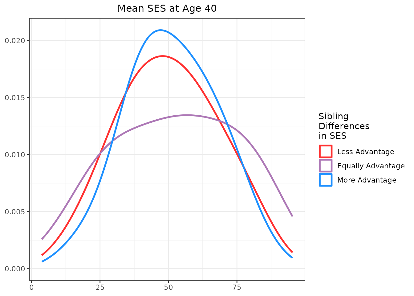
As you can see, the base scatter plot shows a positive association
between mean SES and mean flu vaccinations. Higher average SES among
sibling pairs is associated with higher average flu vaccination rates.
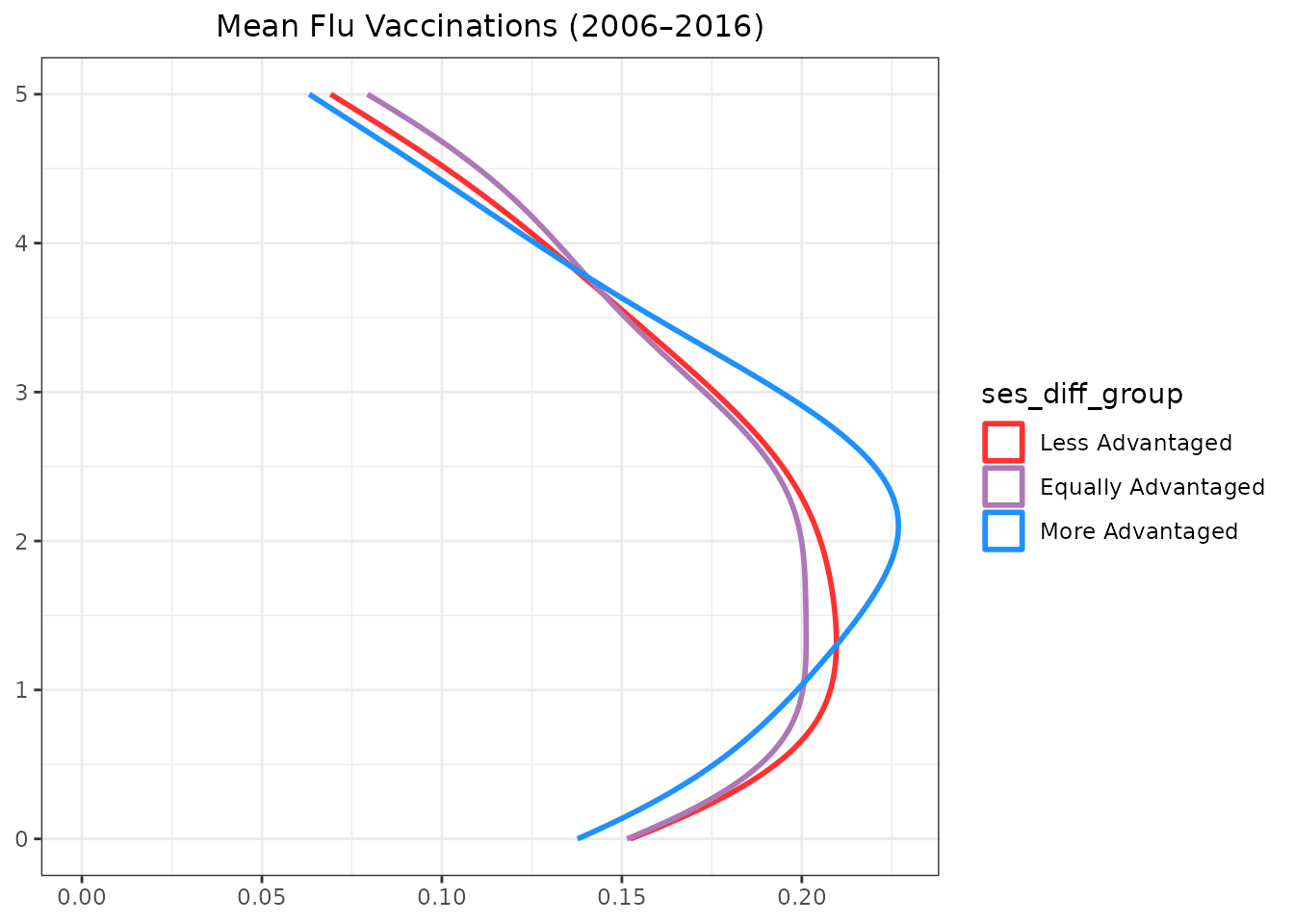
Marginal plots can be added to further illustrate the distributions of
mean SES and mean flu vaccinations. Below is the code to add marginal
plots using the ggExtra package. Note that the marginal
plots are histograms, density plots, or boxplots that show the
distribution of mean SES and mean flu vaccinations, grouped by the SES
difference category.
# Set relative size of marginal plots (main plot 10x bigger than marginals)
ggMarginal(plot_btwn,
  type = "histogram", size = 10, # groupColour = TRUE,
  groupFill = T,
  fill = color_shading_3
)
ggMarginal(plot_btwn, type = "density", size = 10, groupColour = F, groupFill = T, aes(
  color = ses_diff_group,
  fill = ses_diff_group,
  alpha = 0.95
))
ggMarginal(plot_btwn, type = "boxplot", size = 10, groupColour = F, groupFill = T)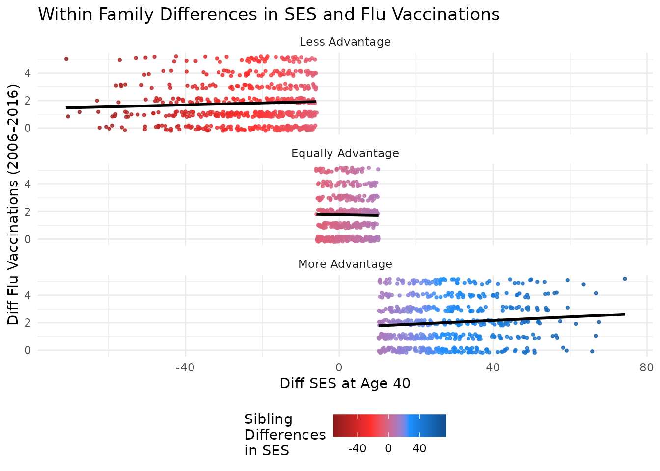
Like the individual-level plot, these between-family plot shows a positive association between mean SES and mean flu vaccinations. Higher average SES among sibling pairs is associated with higher average flu vaccination rates. The marginal plots further illustrate the distributions of mean SES and mean flu vaccinations, grouped by the SES difference category. This helps to visualize how the distributions differ across sibling pairs with varying SES differences.
Adding Marginal Density Plots
An alternative approach is to create marginal density plots
separately and arrange them alongside the main scatter plot using
gridExtra::grid.arrange().
# Marginal X density (SES mean)
plot_xdensity <- ggplot(df_discord_flu, aes(
  x = s00_h40_mean,
  group = ses_diff_group,
  color = ses_diff_group
)) +
  geom_density(adjust = 2, linewidth = 1, fill = NA) +
  scale_colour_manual(
    name = "Sibling\nDifferences\nin SES",
    values = color_shading_3
  ) +
  theme_minimal() +
  theme(
    legend.position = "left",
    axis.title.y = element_blank(),
    axis.text.y = element_blank(),
    legend.title = element_text(size = 8),
    legend.text = element_text(size = 6)
  ) +
  labs(x = NULL, y = NULL)
And for the Y density plot:
# Marginal Y density (Flu mean)
plot_ydensity <- ggplot(df_discord_flu, aes(
  x = flu_total_mean,
  group = ses_diff_group,
  color = ses_diff_group
)) +
  geom_density(
    adjust = 2,
    linewidth = 1,
    fill = NA
  ) +
  scale_colour_manual(
    values = color_shading_3
  ) +
  coord_flip() +
  theme_minimal() +
  theme(
    legend.position = "none",
    axis.title.x = element_blank(),
    axis.text.x = element_blank()
  ) +
  labs(x = NULL, y = NULL)
To finalize the marginal plots, we add titles and adjust themes for better presentation.
Assembling the Final Plot
Finally, we arrange the main scatter plot and the marginal density
plots into a cohesive layout using
gridExtra::grid.arrange(). The x-density plot is placed
above the main scatter plot, and the y-density plot is placed to the
right of the main scatter plot. We can do this by creating a blank
placeholder plot to fill the layout’s empty space.
# Blank placeholder plot
plot_blank <- ggplot() +
  theme_void()

# Final layout
grid.arrange(
  arrangeGrob(plot_xdensity,
    plot_blank,
    ncol = 2,
    widths = c(4, 1)
  ),
  arrangeGrob(plot_btwn,
    plot_ydensity,
    ncol = 2,
    widths = c(4, 1)
  ),
  heights = c(1.5, 4),
  top = textGrob("Sibling Differences in SES and Flu Vaccinations",
    gp = gpar(
      fontsize = 20,
      font = 3
    )
  )
)
#> `geom_smooth()` using formula = 'y ~ x'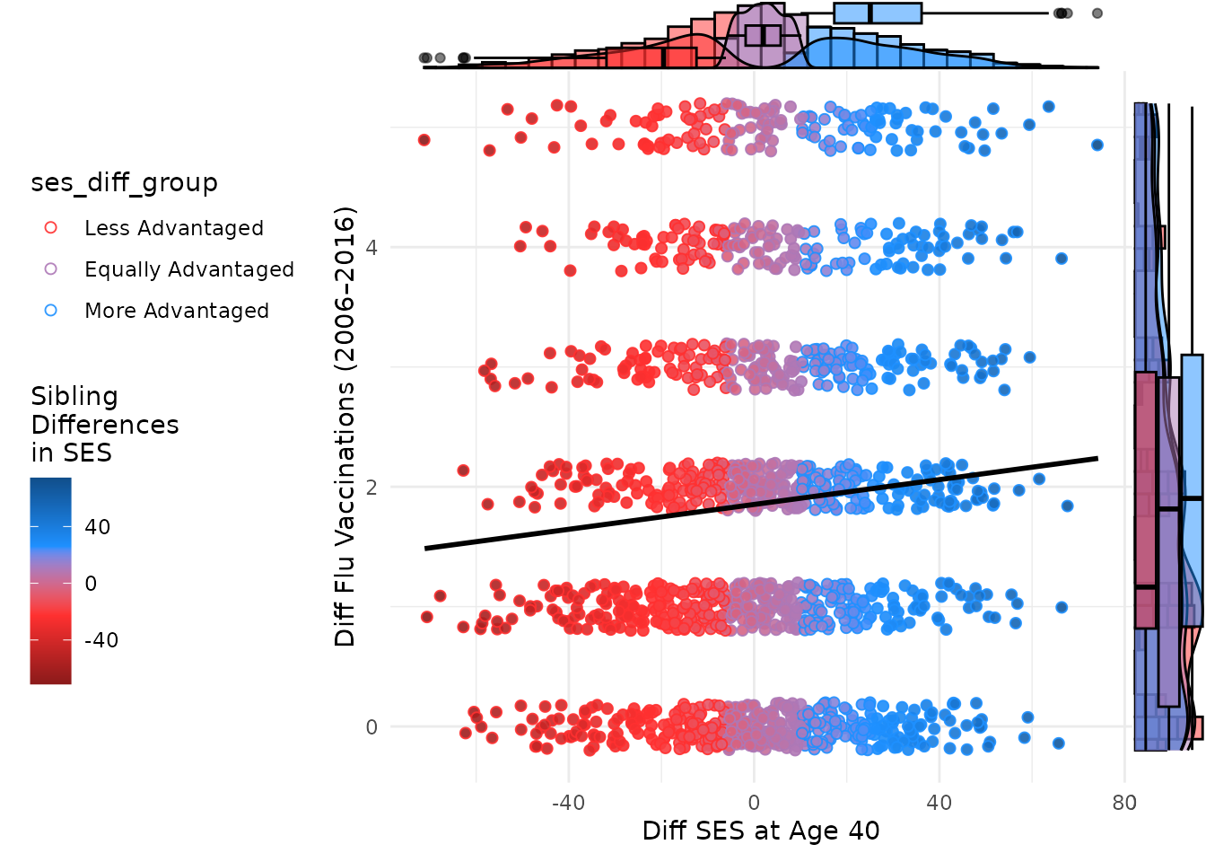
Within Family Plots
This plot compares differences in SES at age 40 to differences in flu vaccinations, with points colored by SES difference. Marginal plots are omitted for simplicity but can be added using the same structure.
# Within Family
#

# Main scatter plot

# Setup: Use discord_data

# Main scatter plot
plot_within <- ggplot(df_discord_flu, aes(
  x = s00_h40_diff,
  y = flu_total_diff,
  color = ses_diff_group
)) +
  geom_point( # this layer creates invisible points to all the marginal plots to align correctly
    size = 1.8, alpha = 0.0, na.rm = TRUE,
    shape = 21,
    position = position_jitter(width = 0.2, height = 0.2, seed = 1234)
  ) +
  geom_point(
    size = 1.8, alpha = 0.9, na.rm = TRUE,
    shape = 21,
    aes(
      fill = s00_h40_diff,
      colour = ses_diff_group
    ),
    group = 1,
    position = position_jitter(width = 0.2, height = 0.2, seed = 1234)
  ) +
  geom_smooth(
    method = "lm",
    se = FALSE,
    color = "black"
  ) +
  scale_fill_gradientn(
    name = "Sibling\nDifferences\nin SES",
    colours = color_shading_4,
    na.value = color_na,
    values = scales::rescale(c(
      -max_val_scale,
      0,
      max_val_scale
    ))
  ) +
  scale_color_manual(
    values = color_shading_3,
  ) +
  theme_minimal() +
  theme(legend.position = "left") +
  labs(
    x = "Diff SES at Age 40",
    y = "Diff Flu Vaccinations (2006–2016)"
  )

plot_within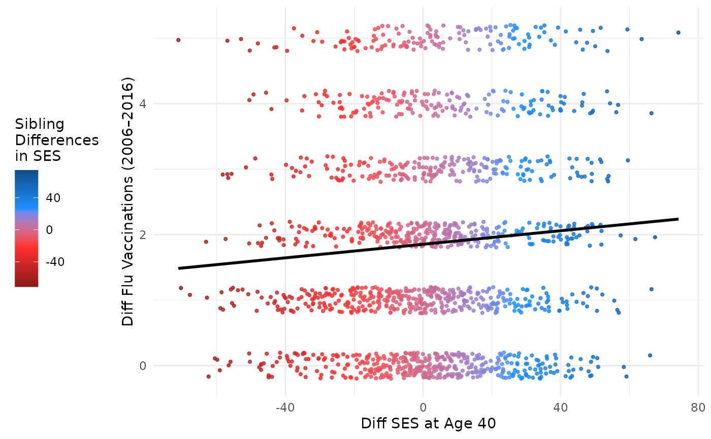
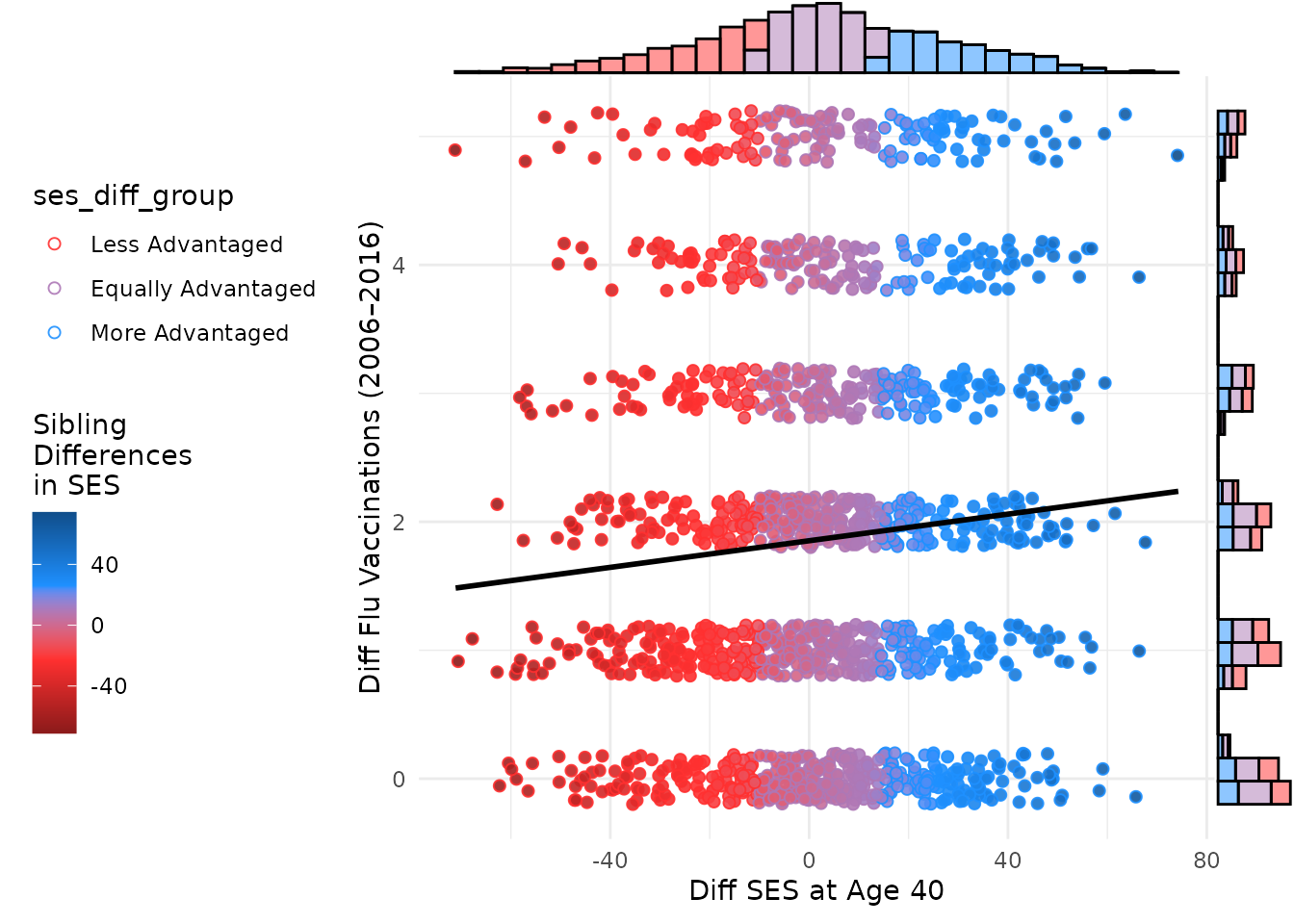
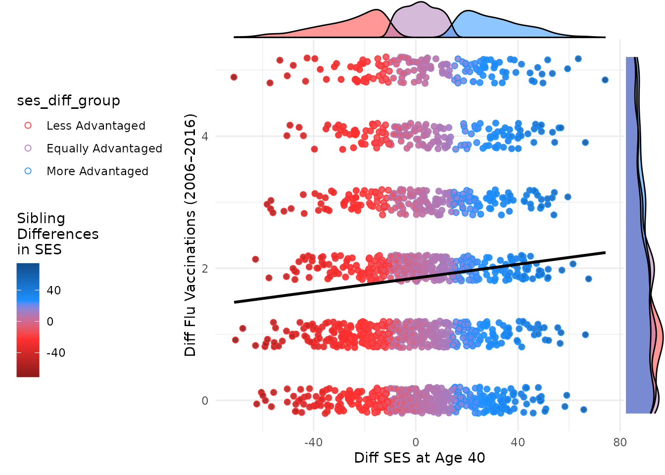
Adding marginal plots to the within-family scatter plot can be done
similarly to the between-family plot. Below is the code to add marginal
plots using the ggExtra package.
# Set relative size of marginal plots (main plot 10x bigger than marginals)
library(ggExtra)
ggMarginal(plot_within,
  type = "histogram", size = 10, # groupColour = TRUE,
  groupFill = T # ,
  #  color = color_shading_3
)
ggMarginal(plot_within, type = "density", size = 10, groupColour = F, groupFill = T, aes(
  color = ses_diff_group,
  fill = ses_diff_group,
  alpha = 0.95
))
ggMarginal(plot_within, type = "boxplot", size = 10, groupColour = F, groupFill = T)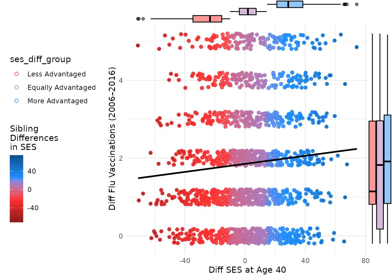
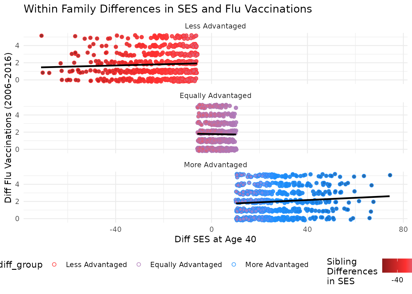
You can further facet this plot by the difference in SES between kin to see how the relationship varies across different groups. The following code does this and adds a title to the plot.
plot_within + facet_wrap(~ses_diff_group,
  ncol = 1
) +
  theme(legend.position = "bottom") +
  labs(title = "Within Family Differences in SES and Flu Vaccinations")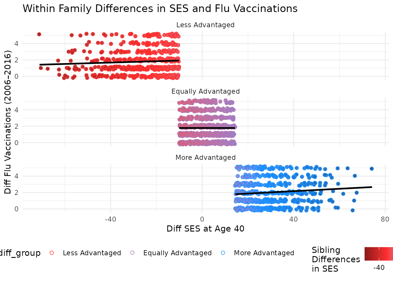
Conclusion
This vignette demonstrated how to visualize sibling differences in SES and flu vaccinations using discord-structured data. Scatter and density plots highlight associations by SES difference group. The use of color to indicate the difference in SES between kin adds an additional layer of insight into the data.